iOS 7: Beyond The Flatness
Yes, Apple’s new mobile operating system looks different. Now what?

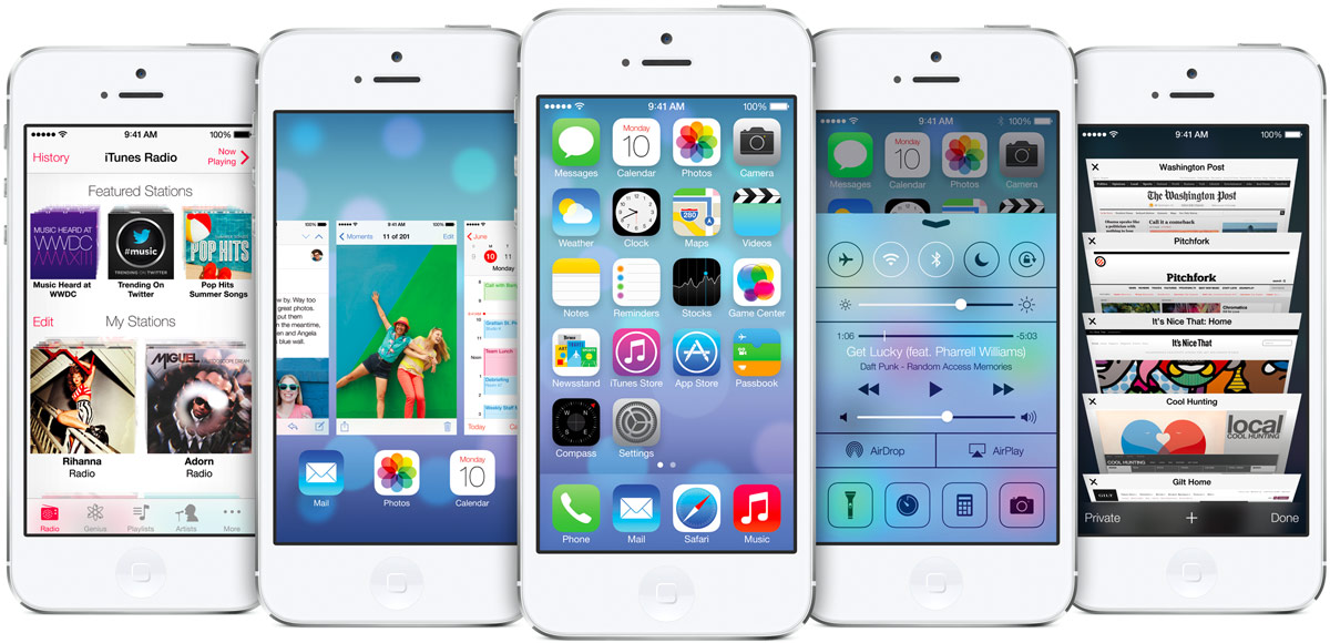
- I actually like the way Apple’s new iOS 7 looks. I don’t immediately prefer it to what it’s replacing — the original iPhone OS was one of the most beautiful interfaces ever imagined. But much like American Airlines’ new paint job, I think I’ll like it more when it’s mine. It certainly fits the times better — including, no doubt, some influence from competitors. And it resets the consistent iOS look to its current feature set. Too many of the mistakes in iOS came with the add-ons, and now there’s a new set of cues to start from — at least for built-in apps, and developers who play along.
- Key phrase, there: “Developers who play along.” It will be interesting to see how many of the top firms — Facebook, Twitter, Instagram, Path, Foursquare, Google — adopt Apple’s new-school design. On one hand, it’s nice when key apps resemble the system they’re part of. On the other, these companies have put a lot of work into developing their own unique looks, and many use them to visually bridge their iOS and Android apps together. My hunch is that we’ll gradually see the iOS 6 “linen” look phased out from most big apps — good riddance. But I’d be surprised if most redid everything to look just like Apple’s stock apps.
- One of my throwaway one-liners about iOS 7 was that Apple “basically traded Lufthansa for Virgin Atlantic.” But I do feel that away. Until now, iOS felt very continental European, including Swiss railway clocks, back buttons that resemble European highway signs, and beaucoup de Helvetica Bold. Like the classic Lufthansa look. Now it feels more modern and skinny, slightly ironic, and trendy, like the new Virgin Atlantic look, and other contemporary British design I’ve seen. Yes, Jony Ive has been in California for a long time now. But that’s how it feels.
- Is this the first iOS designed to look better on a white iPhone than a black one? I haven’t used it yet, but all the white icons might make it pop better. And so far I’ve only seen it demonstrated on white iPhone 5s. Under the current (old?) rules, developers aren’t even supposed to use white-iPhone photos to promote their apps. I wonder if that’ll change now. (And if I’ll use this opportunity to buy my first white Apple portable since my first iPod? Probably not, but who knows.)
- Ok. Beneath the surface. Design is how it works, remember? Is this an improvement? I think so. The basic stuff — being able to turn on Airplane Mode and Bluetooth from the new Control Center — is actually useful. Perhaps it will blend the iPhone and iPad experiences together a bit more? Not having to manually update apps will be good for everyone. The new photo management features look great. AirDrop — transfer files with someone nearby — is something I’d actually use, instead of e-mailing photos to my wife sitting next to me on the couch. The new theft-deterrent activation lock feature sounds like it might actually benefit the planet. There are still some basic, obvious places for improvement in iOS — how various apps can talk to each other, or how two apps could share the screen, or how two people could share an iPad better, for example — but iOS 7 doesn’t just seem like an art project.
- Back to the Mac? It was fitting that Apple showed off the new Mac OS X on Monday before the new iOS, because once again, they look completely different. I wonder if Apple will try bridging them together again more next year, or if that’s a pointless exercise. Anyway, the new OS X looks fine. (Although I was a little surprised that relatively few Mac owners — 35% or something? — have updated to Mountain Lion. Yes, that’s better than ~5% for Windows, but it’s nowhere near 90%+ for iOS.)
- The Cook Offensive. The bigger-picture mission, as highlighted by two motivational videos, including Apple’s new TV commercial, is that the company isn’t just sitting around, trying to figure out what Steve Jobs would have liked everyone to work on. (Actually, you could argue that Jobs might have disliked the iOS 7 look. We’ll never know.) Instead, the message was: Apple is self-aware and it’s playing offense. This leads us to the natural question: Ok, what’s next? Apple’s big thing is the happy marriage of hardware and software, and increasingly, services. This time, we saw a bunch of good-looking mobile software and a few decent-looking services. (Not nearly enough to say that Apple’s out of its “cloud” trouble, but a start.) As usual, “this fall,” I expect we’ll see the new hardware. It may just be the S versions of the iPhone and iPad mini, and a catch-up edition of the big iPad. iOS 7 would certainly run nice enough on those. But maybe there’s something else, something more? That would be a much better way of showing — not just telling — that Apple is moving faster and doing bigger things than ever.

Check out my new site: The New Consumer, a publication about how and why people spend their time and money.

